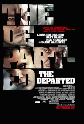
Some may disagree with me but I think this poster for The Departed isn't well designed. It's hard to make out the faces of the stars and with the text split over multiple lines it's hard to read the title. I got two in a stack of posters and had to stop for a second and figure out what movie it was for. I suppose the intent might be to catch people's attention and make them think about it for a second. However, we get so much visual stimulation these days I think a better idea is to keep it simple so one glance can catch your attention.
No comments:
Post a Comment